I’ve waxed lyrical about marketing on here before – we’re almost doing it again!
 Rebekah did a marvelous new cover for Night’s Favor. This book is a huge pain in the ass to do a cover for, because it’s not your usual werewolf book. It’s also not your usual police procedural, thriller, or supernatural suspense. It’s the all-y’all version of those things, and this makes finding readers a hyoooge challenge.
What she came up with is the best damn cover it’s ever had. I mean, you can see what’s going on there, right? We’ve got Val, who’s looking a little fucked if we’re honest with ourselves, and the werewolf about to turn him into a Val-sized snack.
This particular scene happens before the book starts, but that’s not really important. We want a werewolf, we want it now, and we want it eating someone. Result!
Ambient sales for the book have roughly doubled since putting on the new cover, and I’ve played with a couple small ads that are converting. I’d like more people to read this story since it’s not just epic, but about the family you choose. Also, werewolves, violence, and the most John Wick police detective you’ve ever seen.
I shared this with my list a little while ago (get thee on it here) and got a few responses back. Most were praising Rebekah (yawn) but this gentlemen offered some insight into the human condition:
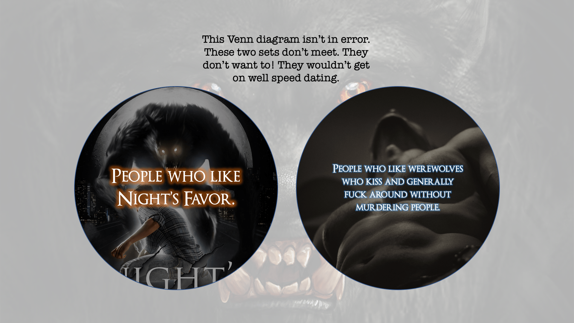
“I personally like the cover, but then, I don’t like kissy werewolves either.”
We are brothers.
I promised a Venn diagram in celebration. Behold! The entire essence of why it’s hard to market Night’s Favor:
If you enjoyed this post, you’ll dig my mailing list. Get yourself on it today.
Discover more from Parrydox
Subscribe to get the latest posts sent to your email.
